
Big Ideas Math Integrated Math Chapter 7 Maintaining Mathematical Proficiency Exercise
Big Ideas Math Integrated Math 1 Student Journal Chapter 7 Solutions Page 188 Exercise 1 Problem 1
Question 1.
Given the following frequency table
\(\begin{array}{|l|l|}\hline \text { Number Range } & \text { Frequency } \\
\hline 0-10 & 5 \\
\hline 11-20 & 8 \\
\hline 21-30 & 12 \\
\hline 31-40 & 7 \\
\hline 41-50 & 3 \\
\hline
\end{array}\)
- Plot a histogram for the given data with the number range on the horizontal axis and frequency on the vertical axis.
- Describe the shape of the histogram and explain what it indicates about the data distribution.
- Determine the number range with the highest frequency and the number range with the lowest frequency.
- Calculate the total number of data points represented in the frequency table.
Answer:
We plot on the horizontal axis the number range.
We plot on the vertical axis frequency which represents the amount of data that is present in each range.
Plot
Read and Learn More Big Ideas Math Integrated Math 1 Student Journal Solutions
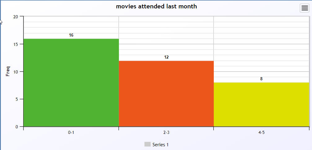
Histogram of the above data is
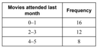
Page 188 Exercise 2 Problem 2
Question 2.
Given the following frequency table
\(\begin{array}{|l|l|}\hline \text { Number Range } & \text { Frequency } \\
\hline 0-5 & 4 \\
\hline 6-10 & 7 \\
\hline 11-15 & 10 \\
\hline 16-20 & 6 \\
\hline 21-25 & 3 \\
\hline
\end{array}\)
- Plot a histogram for the given data with the number range on the horizontal axis and frequency on the vertical axis.
- Describe the shape of the histogram and explain what it indicates about the data distribution.
- Determine the number range with the highest frequency and the number range with the lowest frequency.
- Calculate the total number of data points represented in the frequency table.
Answer:
We plot on the horizontal axis the number range.
We plot on the vertical axis frequency which represents the amount of data that is present in each range.
Plot

The data plotted in a histogram.
Page 188 Exercise 3 Problem 3
Question 3.
A survey of students’ favorite sports yielded the following results:
- Baseball: 10 students
- Tennis: 4 students
- Basketball: 8 students
- Soccer: 7 students
- Golf: 2 students
- Calculate the percentage of students who prefer each sport.
- Assign the calculated percentages to the area of a circle to create a circle graph (pie chart).
- Draw the circle graph based on the percentages of students for each sport.
Answer:
We will find the percent of each sport which will be used to assign the area of a circle
The percentage is the ratio of a student with the sum of total students
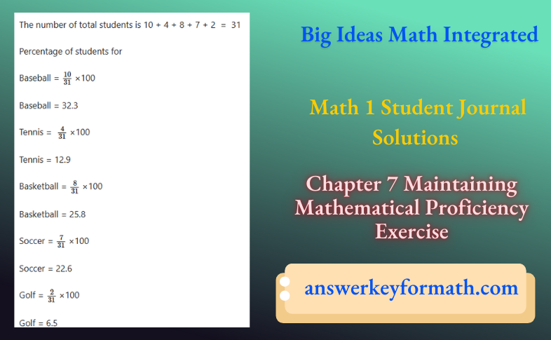
Plot
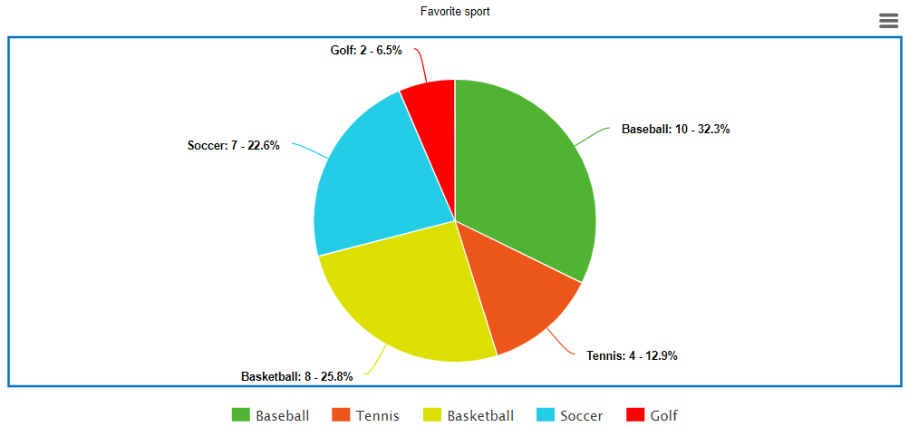
The data is plotted in a circle graph
Page 189 Exercise 4 Problem 4
Question 4.
Given the following data set:
4,8,6,5,3,7,9
- Calculate the mean of the given data set.
- Find the squared differences from the mean for each data point.
- Compute the variance of the data set by summing the squared differences and dividing by the number of data points.
Answer:
Given data set
4,8,6,5,3,7,9
We first get the mean of the given data set.
We use mean to get the difference with all the measures but when sum negative & positive difference got cancel out, so to avoid it we square the difference.
We sum all the difference square error & divide them with a given number of data points which will represent the spread of data.
Variance is the sum of squares that measures how data varies around a mean
Page 189 Exercise 5 Problem 5
Question 5.
The given graphs show the weights of the players on a professional football team and a professional baseball team. The total number of football players is 53, and the total number of baseball players is 40. The total weight of the football team is 13,075 pounds, and the total weight of the baseball team is 8,290 pounds.
- Calculate the mean weight of the football players and describe how much the weights vary from the mean.
- Calculate the mean weight of the baseball players and describe how much the weights vary from the mean.
- Explain the differences in the variation of weights between the football and baseball players.
Answer:
Given
The total number of football players is 53, and the total number of baseball players is 40. The total weight of the football team is 13,075 pounds, and the total weight of the baseball team is 8,290 pounds.
The given graphs show the weights of the players on a professional football team and a professional baseball team.
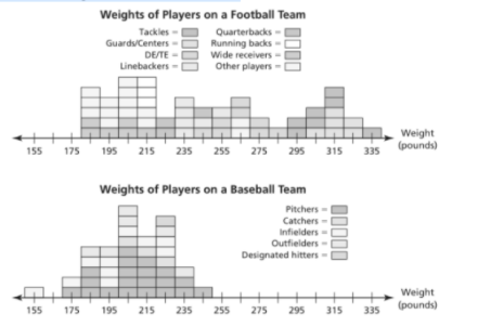
So, we need to describe the data in each graph in terms of how much the weights vary from the mean, and also we have to explain it.
Consider the following graph.
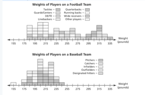
The above graph shows that total 53 football players, 40 baseball players and their total weight is 13075 and 8290 pound respectively.
Thus, the mean of football players weight is given by
\(\frac{13075}{53}\) = 246.25 ≈ 210
Here, the mean may vary up to 85 pounds.
The mean of baseball players weight is given by
\(\frac{8290}{40}\) = 207.25 ≈ 210
Here, the mean may vary up to 210−155 = 55 pounds.
Therefore, the mean of football players weight is approximately 250 pounds. It may vary up to 85 pounds. Also, the mean of baseball players weight is approximately 210 pounds. It may vary up to 55 pounds.
Big Ideas Math Integrated Math 1 Chapter 7 step-by-step solutions Page 189 Exercise 5 Problem 6
Question 6.
Given the graphs that show the weights of the players on a professional football team and a professional baseball team, compare how much the weights of the players on each team vary from their respective means. Use the following information:
- The mean weight of football players is approximately 250 pounds, with a variation of up to 85 pounds.
- The mean weight of baseball players is approximately 210 pounds, with a variation of up to 55 pounds.
- Based on the given means and variations, explain which team’s players have weights that vary more from the mean.
- Discuss possible reasons for the difference in variation between the weights of football players and baseball players.
Answer:
The given graphs show the weights of the players on a professional football team and a professional baseball team.
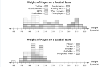
So, we need to compare how much the weights of the players on the football team vary from the mean to how much the weights of the players on the baseball team vary from the mean.
With respect to the previous question, we can say that the mean values of football players weight and baseball players weight are approximately 250 and 210 respectively.
Thus, the weight of football players varies more from the mean as compared to baseball players.
Therefore, we can say that the weight of football players varies more from the mean as compared to baseball players.
Page 189 Exercise 5 Problem 7
Question 7.
Given the graphs showing the weights of the players on a professional football team and a professional baseball team, determine if there is a correlation between the body weights and the positions of players in professional football. Explain your findings based on the following observations:
- Similar positions in football have similar weights.
- The graph for football players’ weights is more consistent compared to the more spread out graph for baseball players’ weights.
Answer:
The given graphs show the weights of the players on a professional football team and a professional baseball team.
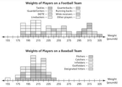
So, we need to check whether there is a correlation between the body weights and the positions of players in professional football or not. Also, we have to explain it.
Consider the following graph.
From the above graph , we can say that similar positions in football have similar weights, whereas the graph in baseball is stretched apart.
Thus, there is a correlation between the body weights and the positions of players in football.
Therefore, there is a correlation between the body weights and the positions of players in football.
Page 190 Exercise 6 Problem 8
Question 8.
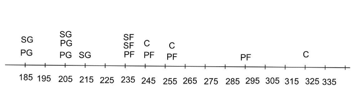
The weights (in pounds) of the players on a professional basketball team by position are as follows:
- Power Forwards (PF): 235, 255, 295, 245
- Small Forwards (SF): 235, 235
- Centers (C): 255, 245, 325
- Point Guards (PG): 205, 185, 205
- Shooting Guards (SG): 205, 215, 185
- Create a graph that represents the weights and positions of the players.
- Analyze the graph and determine if there appears to be a correlation between the body weights and the positions of players in professional basketball.
- Explain your findings and describe any patterns observed in the weights of players by position.
Answer:
The weights (in pounds) of the players on a professional basketball team by position are as follows.
Power forwards: 235,255,295,245
Small forwards: 235,235
Centers: 255,245,325
Point guards: 205,185,205
Shooting guards: 205,215,185.
We to have find there appear to be a correlation between the body weights and the positions of players in professional basketball.
Power forwards: 235, 255, 295, 245
Small forwards: 235, 235; centers: 255, 245, 325
Point guards: 205, 185, 205
Shooting guards: 205, 215, 185.
Yes ,there appear to be a correlation between the body weights and the positions of players in professional basketball.
Guards tend to be lighter and forwards tend to be heavier.
Graph that represents the weights and positions of the players
PF – Power Forwards
SF – Small Forwards
C – Centers
PG – Points Guards
SG – Shooting Guards
The weights (in pounds) of the players on a professional basketball team by position are as follows:
Power forwards: 235, 255, 295, 245; Small forwards: 235, 235; Centers: 255, 245, 325; Point guards: 205, 185, 205; Shooting guards: 205, 215, 185. we make a graph that represents the weights and positions of the players.
Yes ,there appear to be a correlation between the body weights and the positions of players in professional basketball.
Guards tend to be lighter and forwards tend to be heavier.
Chapter 7 Maintaining Mathematical Proficiency Solutions Big Ideas Math Integrated Math 1 Page 190 Exercise 7 Problem 9
Question 9.
Given the following data set of weights (in pounds) of players on a professional basketball team:
235,255,295,245,235,235,255,245,325,205,185,205,205,215,185
- Calculate the mean of the given data set.
- Find the squared differences from the mean for each data point.
- Compute the variance of the data set by summing the squared differences and dividing by the number of data points.
Answer:
Given data set
235,255,295,245,235,235,255,245,325,205,185,205,205,215,185
We first get the mean of the given data set.
We use mean to get the difference with all the measures but when sum negative & positive difference got cancel out, so to avoid it we square the difference.
We sum all the difference square error & divide them with a given number of data points which will represent the spread of data.
Variance is the sum of squares that measures how data varies around a mean
Page 193 Exercise 8 Problem 10
Question 10.
Given the data set:
2,5,16,2,2,7,3,4,4
- Arrange the data points in ascending order.
- Calculate the mean of the data set.
- Determine the median of the data set.
- Identify the mode of the data set.
Answer:
Given data set: 2,5,16,2,2,7,3,4,4
We will arrange all the given data points in ascending order & then count the number of given datapoints.
We get mean by dividing the sum of given with their counts.
We will get median by the middle number.
We will get mode by looking at data set that which number has highest frequency.
Ascending order: 2,2,2,3,4,4,5,7,15
Number of data points is 9 the sum of all data points 2 + 2 + 2 + 3 + 4 + 4 + 5 + 7 + 15 = 44
Mean \(\bar{x}\) = \(\frac{44}{9}\)
\(\bar{x}\) = 4.889
Median is 5th term 4 mode is 2
Mean, median, and mode of the data set are 4.889,4,2 respectively.
Page 193 Exercise 8 Problem 11
Question 11.
Given the data set:
2,5,16,2,2,7,3,4,4
- Arrange the data points in ascending order.
- Identify the median of the data set.
- Explain why the median is considered the value in the center of the data set.
Answer:
Given data set: 2,5,16,2,2,7,3,4,4
We will see which number is in the centre of given data set by analysing mean & median
Half of the values are less than the median and half of the values are more than the median.
So The median is the value in the center of the data.
The median is the value in the center of the data.
Solutions For Big Ideas Math Integrated Math 1 Chapter 7 Maintaining Mathematical Proficiency Exercises Page 194 Exercise 9 Problem 12
Question 12.
Given the heights (in inches) of players on Team A and Team B:
- Team A Heights: 58, 75, 60, 48, 56, 78, 60, 57, 54, 59
- Team B Heights: 49, 50, 70, 56, 58, 66, 64, 57, 62, 63
- Arrange the heights of Team A and Team B in ascending order.
- Calculate the range of heights for Team A.
- Calculate the range of heights for Team B.
- Explain why the range of height for Team B is less than the range of height for Team A.
Answer:
Given:
Team A Heights (inches):: 58,75,60,48,56,78,60,57,54,59
Team B Heights (inches):: 49,50,70,56,58,66,64,57,62,63
We will set the data from least to greatest.
We will subtract the smallest value from the largest value
Team A Heights (inches) in order
48,54,56,57,58,59,60,60,75,78
Range of Team A Heights (inches) is 78 − 48 = 30
Team B Heights (inches) in order
49,50,56,57,58,62,63,64,66,70
Range of Team B Heights (inches) is 70 − 49 = 21
For team B is less because its highest player is 70 inches less then 78 inches which is team A highest player
Range of Team A Heights (inches) is 30 & range of Team B Heights (inches) is 21 for team B is less because its highest player is 70 inches less than 78 inches which is team A highest player
Page 194 Exercise 10 Problem 13
Question 13.
Given the heights (in inches) of players on Team A:
58,75,60,48,56,78,60,57,54,59:
- Calculate the mean height \((\bar{x})\) of Team A.
- Find the deviation of each data value from the mean.
- Square each deviation.
- Calculate the variance by finding the mean of the squared deviations.
- Determine the standard deviation by taking the square root of the variance.
Answer:
Given:
Team A Heights (inches): 58,75,60,48,56,78,60,57,54,59
Step 1 – Find the mean \(\bar{x}\)
Step 2 – Find the deviation of each data value \(x-\bar{x}\)
Step 3 – Square each deviation (\(x-\bar{x}\))2
Step 4 – Find the mean of the squared deviations. This is called variance.
Step 5 – Take the square root of the variance.
Mean
\(\bar{x}\) = \(\frac{58+75+60+48+56+78+60+57+54+59}{10}\)
\(\bar{x}\) = 60.5
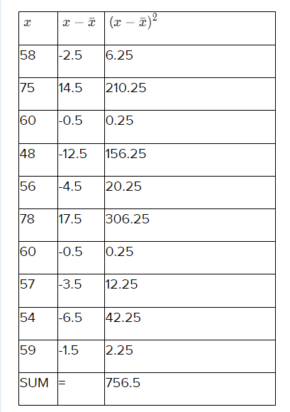
\(\sigma \) = \( \sqrt{\frac{756.5}{10}}\)
\(\sigma \) = \( \sqrt{75.65}\)
\(\sigma\) = 8.69
The standard deviation of the heights of Team A is 8.69
Big Ideas Math Integrated Math 1 Student Journal Chapter 7 Guide Page 194 Exercise 10 Problem 14
Question 14.
Given the heights (in inches) of players on Team B:
49,50,70,56,58,66,64,57,62,63:
- Calculate the mean height \((\bar{x})\)of Team B.
- Find the deviation of each data value from the mean.
- Square each deviation.
- Calculate the variance by finding the mean of the squared deviations.
- Determine the standard deviation by taking the square root of the variance.
Answer:
Given:
Team B Heights (inches): 49,50,70,56,58,66,64,57,62,63
Step 1 – Find the mean,\(\bar{x}\)
Step 2 – Find the deviation of each data value, \(x-\bar{x}\)
Step 3 – Square each deviation (\(x-\bar{x}\))2
Step 4 – Find the mean of the squared deviations This is called variance.
Step 5 – Take the square root of the variance.
Mean
\(\bar{x}\) = \(\frac{49+50+70+56+58+66+64+57+62+63}{10}\)
\(\bar{x}\) = 59.5
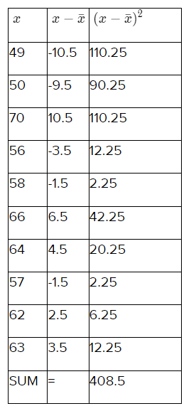
\(\sigma\) = \(\sqrt{\frac{408.5}{10}}\)
\(\sigma\) = \(\sqrt{40.85}\)
\(\sigma\) = 6.39
The standard deviation of the heights of Team B is 6.39
Page 194 Exercise 10 Problem 15
Question 15.
The standard deviations for the heights of players on Team A and Team B are 8.69 and 6.39, respectively:
- Explain what the standard deviation tells us about a data set.
- Compare the standard deviations of Team A and Team B and interpret what this comparison indicates about the spread of heights in each team.
- Based on the standard deviations, which team has heights that are more consistently close to the mean? Provide a brief explanation.
Answer:
Given
The standard deviations for the heights of players on Team A and Team B are 8.69 and 6.39, respectively
We know standard deviations for Team A and Team B are 8.69 and 6.39.
The standard deviation of a numerical data set is a measure of how much a typical value in the data set differs from the mean
Standard deviations for Team A and Team B are 8.69 and 6.39.
Standard deviations for Team A is more than Team B which means values of Team A is more spread than Team B
Values of Team A is more spread than Team B
Page 194 Exercise 11 Problem 16
Question 16.
Given the following measures for a data set:
- Mean: 42
- Median: 40
- Mode: 38
- Range: 15
- Standard deviation: 4.9
If each value in the data set increases by 8, calculate the new values for the mean, median, mode, range, and standard deviation. Explain how each measure is affected.
Answer:
Given:
Mean: 42
Median: 40
Mode: 38
Range: 15
Standard deviation: 4.9
when values of the measures shown when each value in the data set increases by 8
Mean, Median, Mode will increase by 8
Range, Standard deviation will remain same
After the values of the measures shown when each value in the data set increases by 8
Mean = 42 + 8
Mean is 50
Median = 40 + 8
Median is 48
Mode is 38 + 8
Mode is 46
Range is 15
Standard deviation is 4.9
Mean is 50
Median is 48
mode is 46
Range is 15
The standard deviation is 4.9
Chapter 7 Maintaining Mathematical Proficiency Explained Big Ideas Math Integrated Math 1 Page 195 Exercise 12 Problem 17
Question 17.
Explain why box and whisker plots are ideal for comparing distributions. Describe what a box and whisker plot represents and how it can be used in explanatory data analysis. Use the following prompts to guide your explanation:
- What information is conveyed by the center, spread, and overall range in a box and whisker plot?
- How does a box and whisker plot summarize a set of data measured on an interval scale?
- What features of a distribution are highlighted by a box and whisker plot?
- Why are box and whisker plots often used in explanatory data analysis?
Answer:
Box and whisker plots are ideal for comparing distributions because the center, spread, and overall range are immediately apparent.
A box and whisker plot is a way of summarizing a set of data measured on an interval scale.
It is often used in explanatory data analysis.
This type of graph is used to show the shape of the distribution, its central value, and its variability.
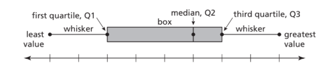
Box and whisker plots are often used in explanatory data analysis.
Worked Examples For Big Ideas Math Integrated Math 1 Chapter 7 Maintaining Mathematical Proficiency Page 195 Exercise 13 Problem 18
Question 18.
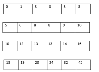
Given a data set representing the number of first cousins of the students in a ninth-grade class, the data is ordered on a strip of grid paper with 24 equally spaced boxes.
- Write the data in ascending order in the 24 boxes.
- Fold the paper into halves to find the median.
- Calculate the median as the mean of the 12th and 13th observations.
Answer:
Given: A data representing numbers of first cousins of the students in a ninth-grade class.
To find – Order the data on a strip of grid paper with 24 equally spaced boxes.
We will write the given data in ascending order in the boxes.

After folding the paper into halves, we get the median as mean of 12th and 13th Observation
⇒ Median = \(\frac{10+10}{2}\)
⇒ Median = 10.
The final answer is that the ordering of the given data into 24 equally spaced strip is and after folding the paper into halves, we get the median as 10 .

Page 195 Exercise 13 Problem 19
Question 19.
Given a data set representing the number of first cousins of the students in a ninth-grade class, arranged in ascending order in 24 equally spaced boxes, find the following:
- The least value
- The greatest value
- The first quartile (Q1)
- The third quartile (Q3)
Answer:
Given: A data representing numbers of first cousins of the students in a ninth-grade class.
To find – The least value, the greatest value, the first quartile, and the third quartile.
First of all we will divide the 24 equally spaces boxes into four groups such that each group will have 6 numbers.
Then using these groups we will find out the least value, the greatest value, the first quartile and the third quartile.
∵ The order of the data in a 24 equally spaced boxes is

After folding the paper in half again, we get the four groups as
⇒ Least value = 0
Greatest value = 45
∵ First quartile will be mean of 6th and 7th observation.
⇒ First quartile = \(\frac{3+5}{2}\)
⇒ First quartile = 4 .
∵ Third quartile will be mean of 18th and 19th observation.
⇒ Third quartile = \(\frac{16+18}{2}\)
⇒ Third quartile = 17 .
The final answer is that after folding the boxes in another half, we get four groups of 6 numbers such that the least value is 0 ,the greatest value is 45 , the first quartile is 4 and the third quartile is 17.
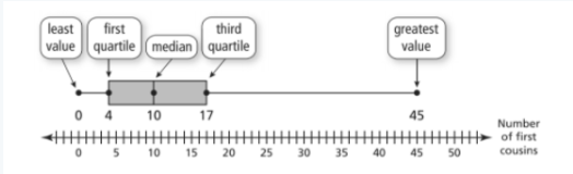
Big Ideas Math Integrated Math 1 Chapter 7 Detailed Answers Page 195 Exercise 13 Problem 20
Question 20.
Given a data set represented by a box-and-whisker plot, which shows the variability of the data along a number line using the least value, the greatest value, and the quartiles:
- The lowest value is 0.
- The greatest value is 45.
- The median (second quartile, Q2) is 10.
- The first quartile (Q1) is 4.
- The third quartile (Q3) is 17.
- Describe how a box-and-whisker plot represents the given data set.
- Identify the least value, greatest value, median, first quartile, and third quartile from the data set.
- Explain the significance of the median, first quartile, and third quartile in dividing the data set.
- Draw a box-and-whisker plot using the given values.
Answer:
A box-and-whisker plot shows the variability of a data set along a number line
using the least value, the greatest value, and the quartiles of the data.
Quartiles divide the data set into four equal parts.
The median (second quartile, Q2) divides the data set into two halves.
The median of the lower half is the first quartile, Q1.
The median of the upper half is the third quartile, Q3.
In this median is 10 the least value is 0 the greatest value is 45.
The median of the lower half is the first quartile, Q1 & The median of the upper half is the third quartile, Q3
The median of the lower half is 4
The median of the upper half 17
The data set has:
Median is 10
The least value is 0
The greatest value is 45
The median of the lower half is 4
The median of the upper half 17
Page 196 Exercise 14 Problem 21
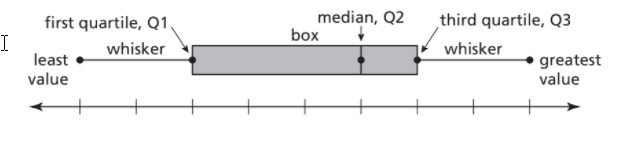
Question 21.
Explain how a box-and-whisker plot represents the variability of a data set. Use the following points to guide your explanation:
- Define the components of a box-and-whisker plot (least value, greatest value, first quartile, median, and third quartile).
- Describe how quartiles divide the data set into four equal parts.
- Explain the significance of the median, first quartile, and third quartile in the context of a box-and-whisker plot.
- Discuss why box-and-whisker plots are often used in explanatory data analysis.
Answer:
A box-and-whisker plot shows the variability of a data set along a number line using the least value, the greatest value, and the quartiles of the data.
Quartiles divide the data set into four equal parts.
The median (second quartile, Q2) divides the data set into two halves.
The median of the lower half is the first quartile, Q1.
The median of the upper half is the third quartile, Q3.

Box and whisker plots are often used in explanatory data analysis.
Page 196 Exercise 15 Problem 22
Question 22.
Given the body mass indices (BMI) of students in a ninth-grade class as represented in a box-and-whisker plot:
- Identify the median (second quartile, Q2).
- Identify the first quartile (Q1).
- Identify the third quartile (Q3).
- Identify the least value.
- Identify the greatest value.
Answer:
A box-and-whisker plot shows the variability of a data set along a number line using the least value, the greatest value, and the quartiles of the data.
Quartiles divide the data set into four equal parts.
The median (second quartile, Q2) divides the data set into two halves.
The median of the lower half is the first quartile, Q1.
The median of the upper half is the third quartile, Q3.

In given plot
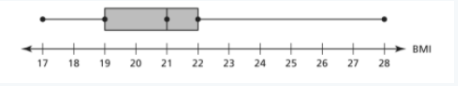
The median (second quartile, Q2) is 21
The median of the lower half ( first quartile, Q1 ) is 19
The median of the upper half ( third quartile, Q3.) is 22
the least value is 17
the greatest value is 28
Body mass indices (BMI) of students in a ninth-grade class has:
The median (second quartile, Q2) is 21
The median of the lower half ( first quartile, Q1 ) is 19
The median of the upper half ( third quartile, Q3.) is 22
The least value is 17
the greatest value is 28
Page 196 Exercise 15 Problem 23
Question 23.
Given the heights of roller coasters at an amusement park as represented in a box-and-whisker plot:
- Identify the median (second quartile, Q2).
- Identify the first quartile (Q1).
- Identify the third quartile (Q3).
- Identify the least value.
- Identify the greatest value.
Answer:
A box-and-whisker plot shows the variability of a data set along a number line using the least value, the greatest value, and the quartiles of the data.
Quartiles divide the data set into four equal parts.
The median (second quartile, Q2) divides the data set into two halves.
The median of the lower half is the first quartile, Q1.
The median of the upper half is the third quartile, Q3.

In given plot
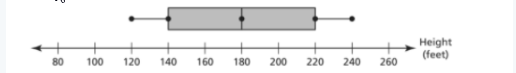
The median (second quartile, Q2) is 180
The median of the lower half ( first quartile, Q1 ) is 140
The median of the upper half ( third quartile, Q3.) is 220
The least value is 120
The greatest value is 240
Heights of roller coasters at an amusement park has:
The median (second quartile, Q2) is 180
The median of the lower half ( first quartile, Q1 ) is 140
The median of the upper half ( third quartile, Q3.) is 220
the least value is 120
the greatest value is 240